GRANIZO FESTIVAL
- Client
- Festival Granizo
- Year
- 2026
- Role
- Identity, signage, and print
- Disciplines
- Identity, Wayfinding, Poster
Outcome
31,000 people over three days, and security reported fewer wristband disputes than any year on record. Granizo has kept the system for 2027.
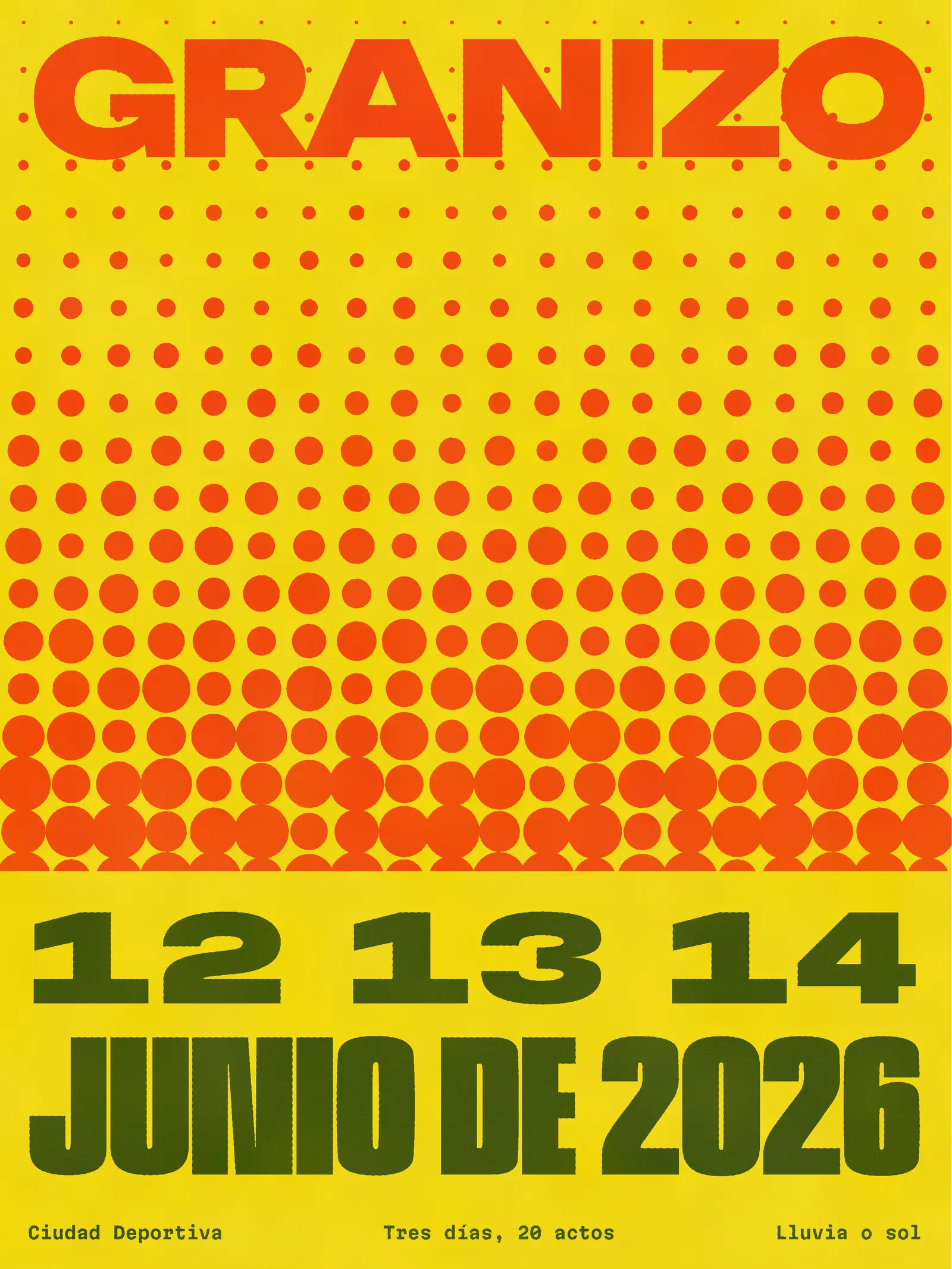
The brief
Granizo takes its name from the hail that closed its first edition at Ciudad Deportiva. It is held in June, on purpose, and the organizers wanted an identity that took the weather as a promise, not a risk.
It had to run across posters, a line-up, stage signs, wristbands, and a social calendar, handled by a five-person team and a dozen suppliers.
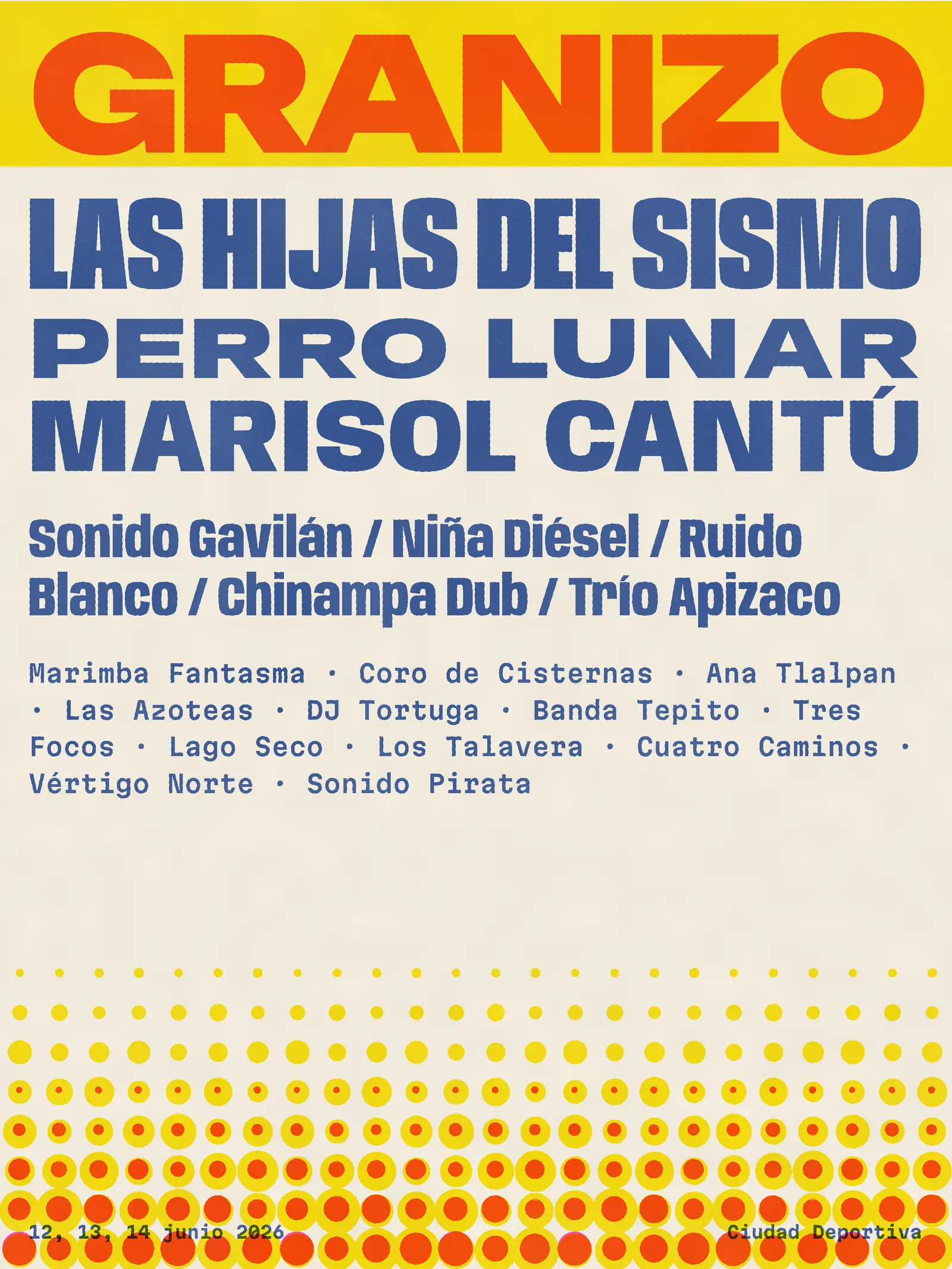
The constraint
Security needed day passes that staff could tell apart at a glance, at night, in rain. Most festival wristbands do this with color, and under stage light most colors disappear. Signs also had to read through a wet poncho hood, from 40 meters, in a crowd with no shared language for the site.
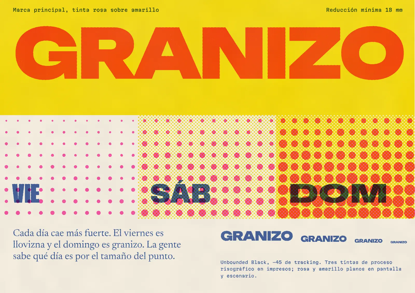
The decisions
One idea runs through everything: the hail dot gets heavier as the weekend goes on. Friday’s dot is barely there and Sunday’s nearly touches its neighbours. Since size survives bad light and color doesn’t, the wristbands became a size code. A guard can read it from across a turnstile.
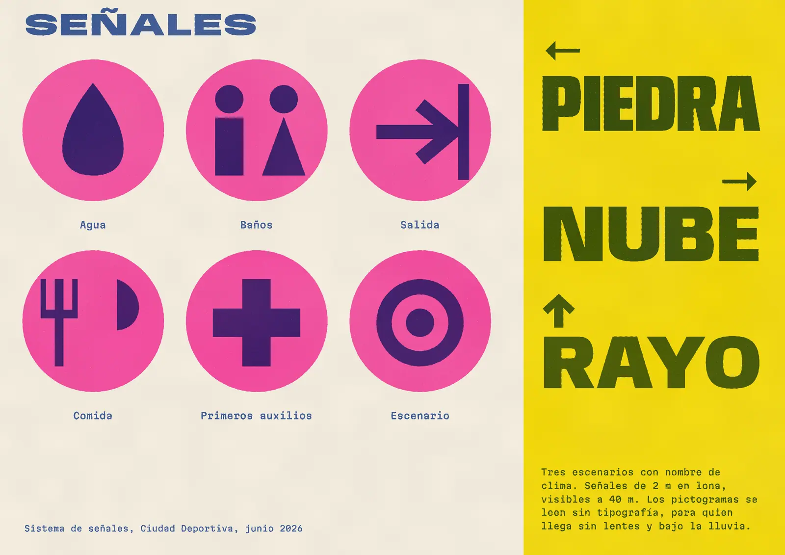
The logotype is one heavy, wide word, set big enough on every piece to survive being photographed through rain. The stages are named Piedra, Nube, and Rayo, so signs are three big words and an arrow.
Pictograms are drawn from the same dot on a pink disc. I tested them with a group of people who took off their glasses. Two drawings failed, and I redrew them.
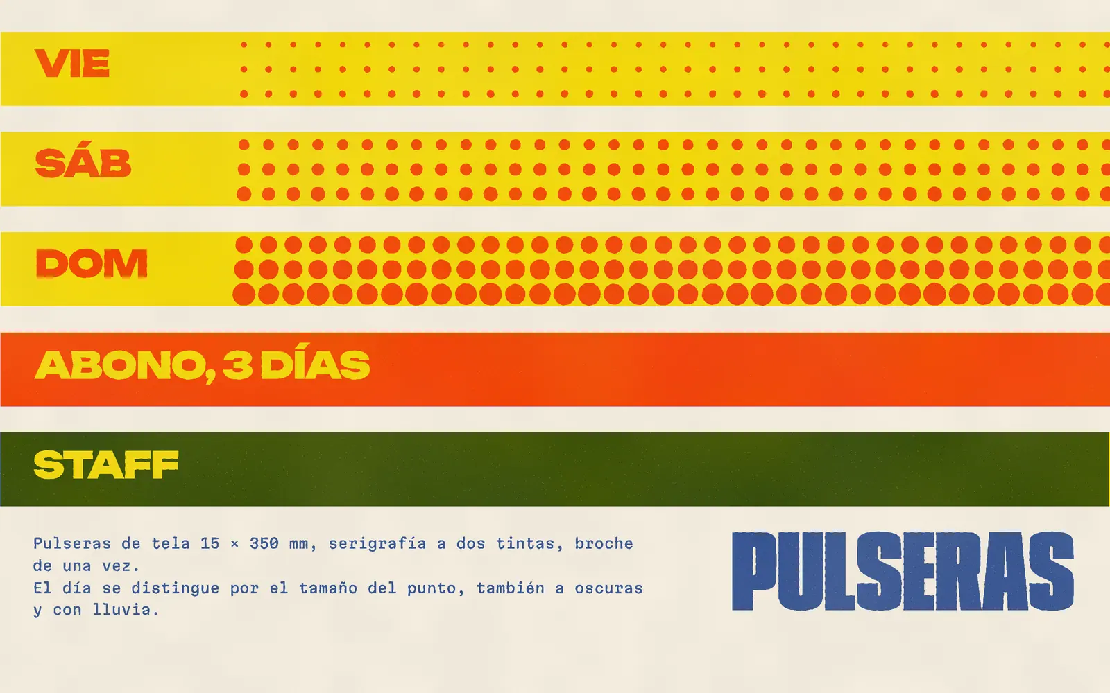
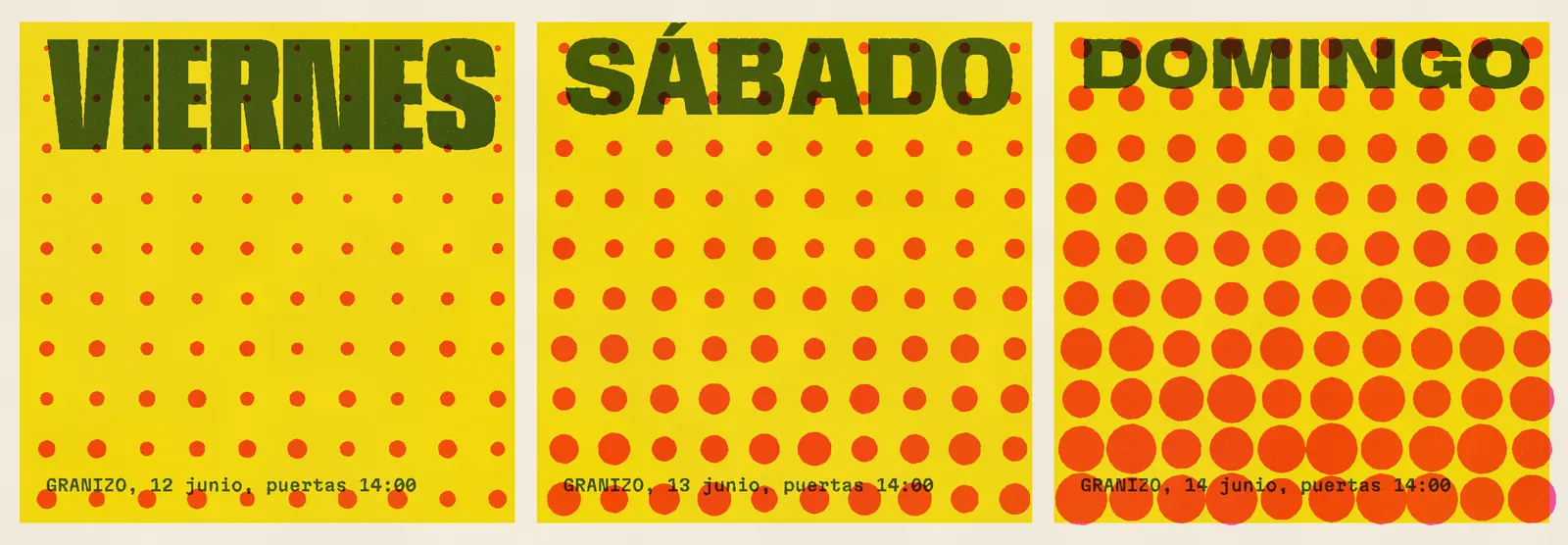
First year no one tried to get into Sunday on a Friday band. They can see the difference from the fence.
- 31,000
- attendees over three days
- 3
- dot weights, one per day
- 40 m
- sign legibility, tested
- 12
- suppliers on one spec sheet
Credits
- Identity and print
- Juno Reyes
- Festival director
- Andrea Peralta
- Operations
- Dolores Ibarra
- Sign fabrication
- Lonas Azcapotzalco