TEZONTLE SPECIMEN
- Client
- Self-initiated
- Year
- 2024
- Role
- Type design and specimen
Outcome
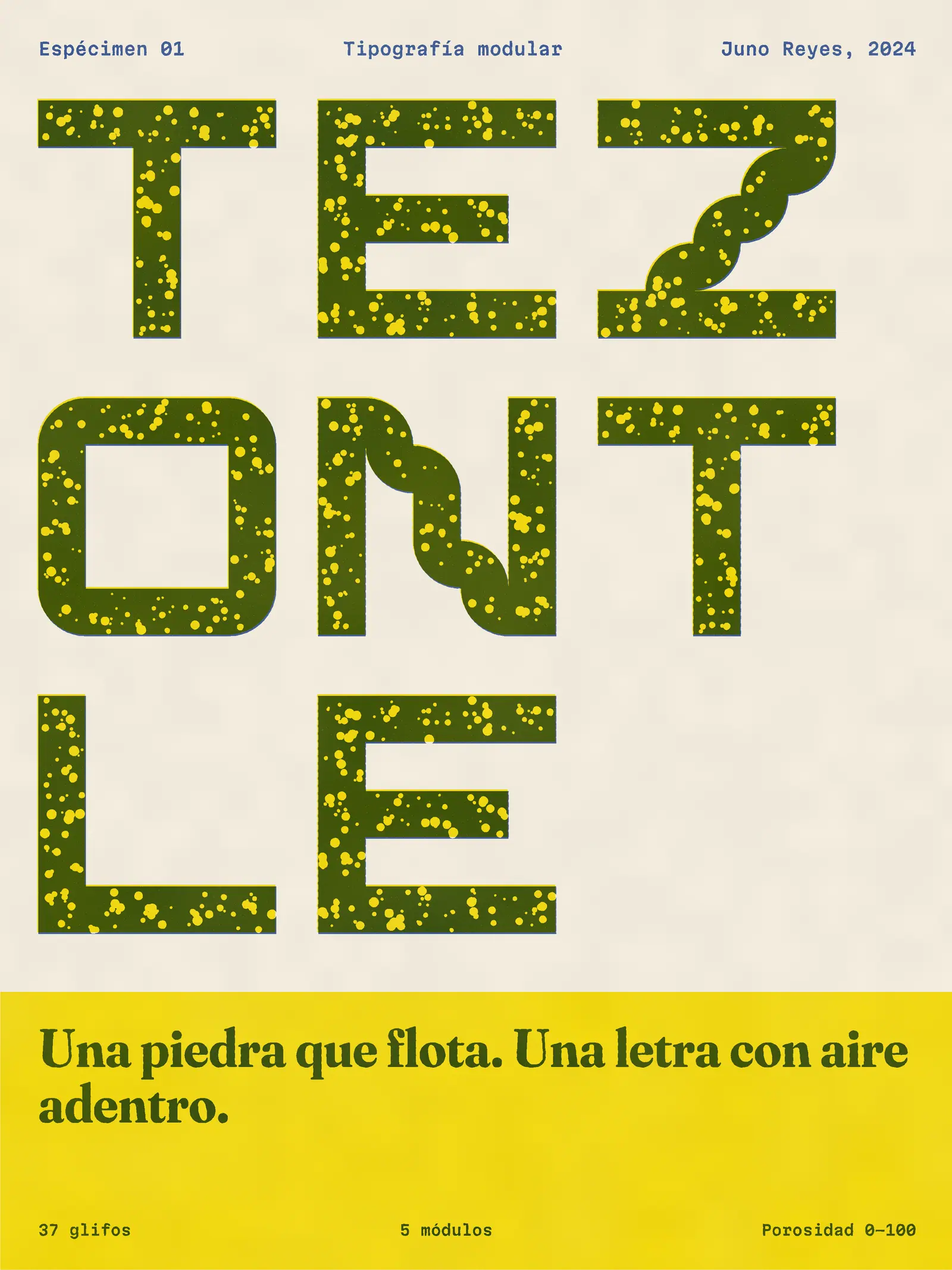
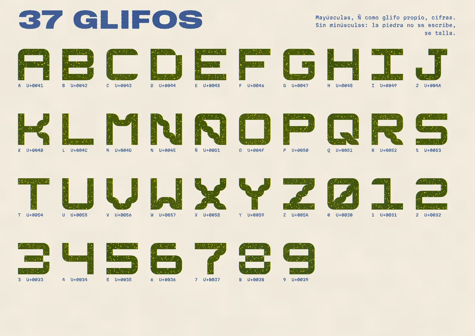
Selected for the Tipos Latinos open-font showcase in 2024. Released under the SIL Open Font License, it has since turned up on two record sleeves and a brewery I’ve never met.
The brief
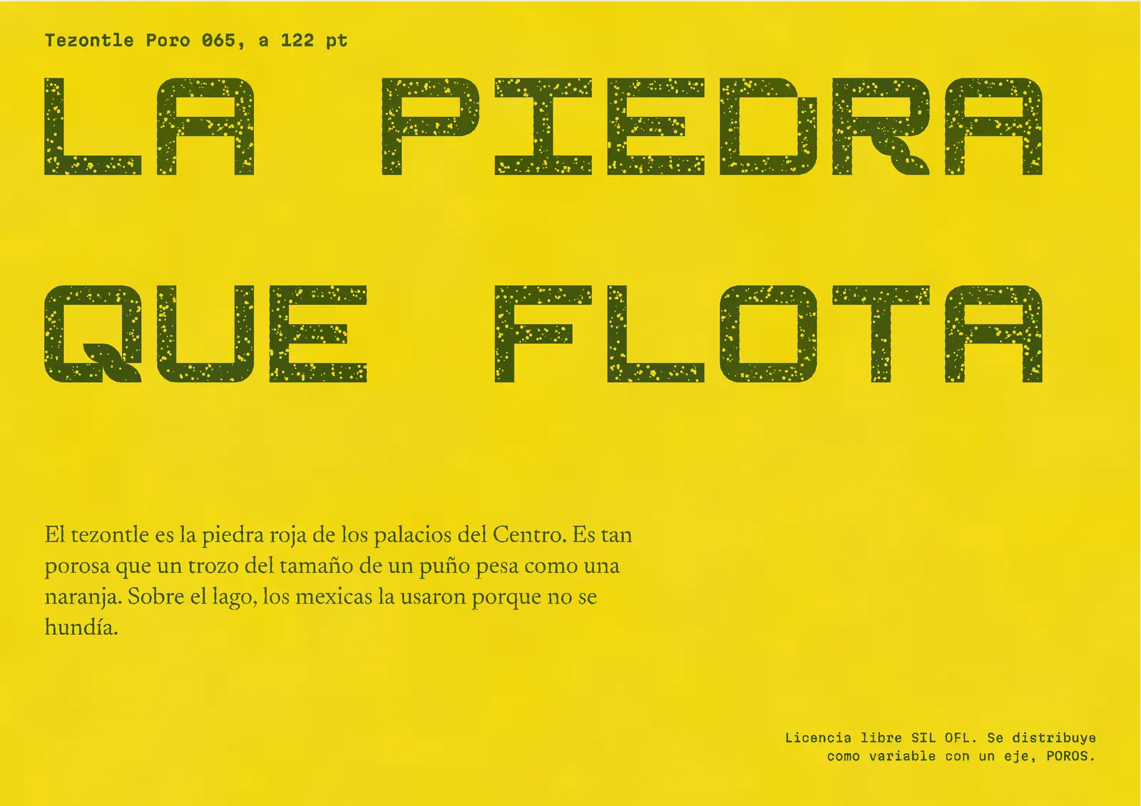
I gave this one to myself. Tezontle is the red, volcanic stone of the old palaces in the Centro Histórico, so full of air that a fist-sized piece weighs about the same as an orange. The Mexica built with it on the lakebed because it didn’t sink.
I wanted a typeface that could be light in the same way: a heavy letter with holes in it, where you’d choose how many.
The constraint
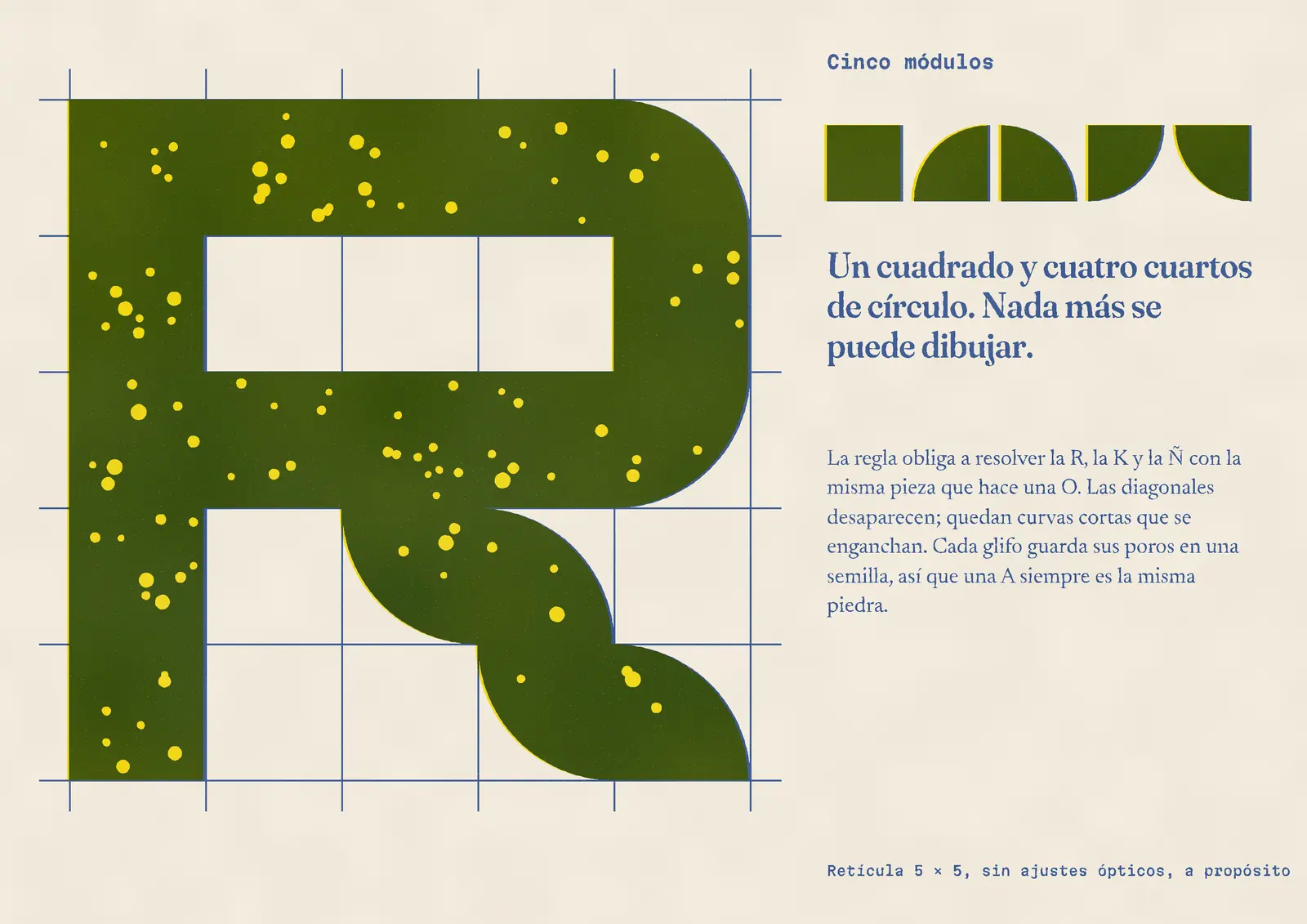
Five modules: one square and four quarter circles, on a 5 × 5 grid, with no optical corrections. That rule has to resolve a K, an R, a Ñ, and an 8 using the same pieces that draw an O. Diagonals are not possible, so they turn into short linked curves. It is ugly in places, and I left those places in.
The decisions
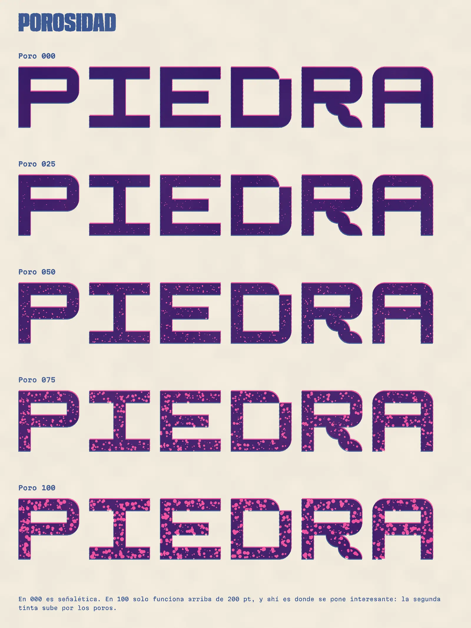
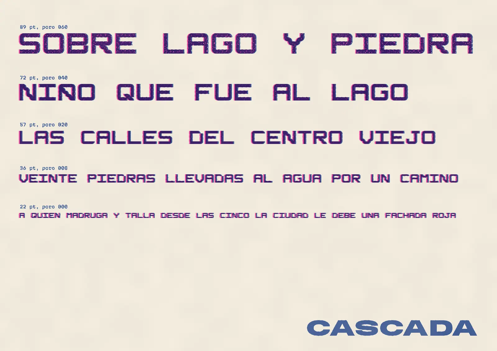
The axis is called POROS. Each glyph stores a seed for where its pits fall, so an A is always the same stone, however much of it has eroded. At 000 the face is signage. At 100 it only works above 200 points.
The specimen prints the holes on one plate and a solid backing on the other, so the second ink rises up through the letter. That’s the part you can only get in print. I pitched it as the reason to have a printed specimen at all.
- 37
- glyphs
- 5
- modules
- 0–100
- on the POROS axis
- OFL
- open license
Credits
- Type design and specimen
- Juno Reyes
- Font engineering
- Sara Montiel
- Printing
- Taller Tinta Corrida